04.06.07
Nebulabrot
While reading Wikipedia’s Mandelbrot set article, I stumbled upon the exceedingly cool Buddhabrot, and the even cooler Nebulabrot:
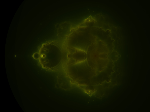
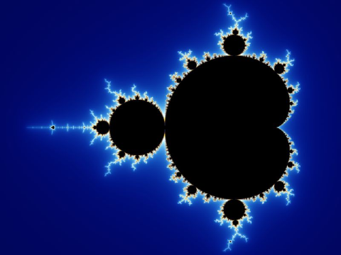
I’ll write more about the math later, but what I find most interesting about it is how it naturally fills in the “boring space” inside the Mandelbrot set:
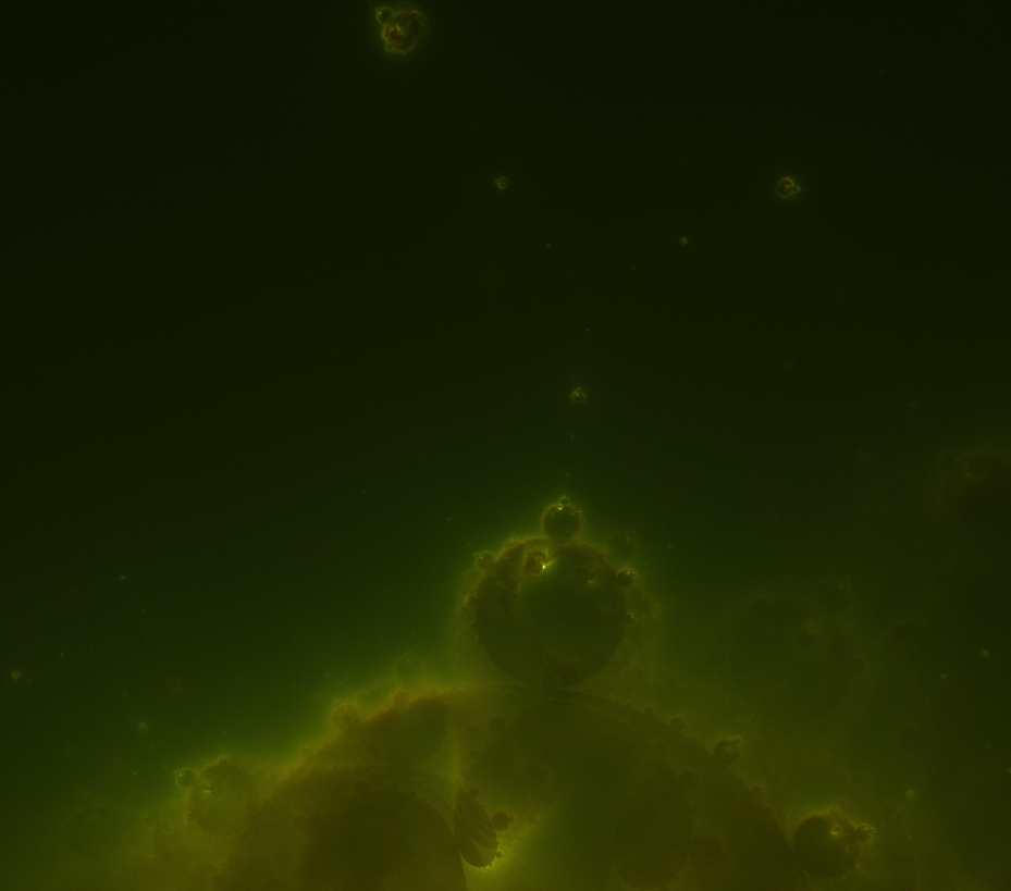
The interior of the Nebulabrot is also a fractal, as a zoom shows:

Those little buds are all Mandelbrots.
Being a CS-type, once I saw the definition, I immediately set out to render the most detailed Nebulabrot ever seen. It’s 10240×7680 and gorgeous. Here are some zooms (click for full-res versions):
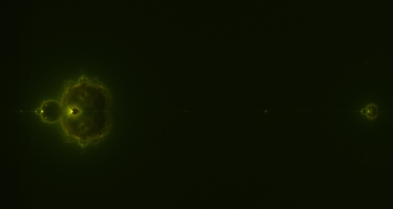
“Island universes” along the negative x-axis
Here’s a link to the full JPEG (4.3MB) and the full PNG (44 MB).
If you zoom all the way in, you’ll see some graininess, even in the PNG. This isn’t a compression artifact. It’s a hint of further structure. If I’d cranked up the dwell limit in my rendering, the noise would have been even more miniature Mandelbrot sets!
Update: MarkCC over at Good Math, Bad Math has a post about MapReduce that discusses the way I generated this at length.
Lepht said,
July 11, 2007 at 1:05 pm
holy fucking shit. that’s some eyebleedingly awesome mathematics right there. i’m gonna show these to the next person that tells me maths is for nerdy assholes. cheers
Lepht
cleek » danvk.org » Nebulabrot said,
August 5, 2007 at 6:39 pm
[...] Nebulabrot Filed under: Uncategorized — cleek @ 2:28 pm [...]
vm ganata said,
January 23, 2008 at 10:51 pm
OMG. It looks almost like a coronal section of an MRI of the brain.
lb said,
January 26, 2008 at 5:20 am
impressive work! and good looking stuff.
Tim Wintle said,
February 3, 2008 at 7:47 am
That is amazing – a really great image. Out of interest, how many machines were you running it across, how long did the job take, and what implementation of map-reduce were you using (Hadoop / Google / A custom version)?
Steve said,
March 3, 2008 at 6:26 am
This is very cool. I am currently learning about MapReduce in a class I’m taking on parallel processing. I would be interested in seeing the code you used to generate the image to see how you split the algorithm/data. All of the MapReduce examples I’ve seen are all about counting words in documents and distributed searches/grep. They are overly simplistic and don’t really provide a clear idea of how to apply it more complex problems.
Is your code posted somewhere?
tom said,
March 25, 2008 at 11:10 pm
how long did it take to render?
Cody-7 said,
May 8, 2008 at 10:25 am
Or better yet, what program did you use to render the nebularot?
I’m trying to make my own renders but I’m not having much luck finding a good program. It seems it’s the big thing for everyone to render a mandlebrot sent and not tell what program was used.
Tim Wintle said,
May 23, 2008 at 12:53 am
Cody-7:
The point is that he wrote the software himself using the map-reduce programming model – it’s not that tough if you happen to have a map-reduce cluster lying around (or even if you don’t – the map-reduce model works with unix pipes; which are in OSX, and were on Windows NT too, but I think they removed pipes in XP)
Simon C. Ion said,
December 2, 2008 at 5:48 am
Tim Wintle:
Windows still has pipes. They’re mentioned here:
http://msdn.microsoft.com/en-us/library/aa365780(VS.85).aspx (When this link fails to work: Ask Google about “Windows Pipes” or “Named Windows Pipes”)
Are they *functionally* that much different from UNIX pipes?
Jin said,
January 21, 2010 at 3:00 pm
Hi,
So when I tried to render it I keep getting an anti-Buddhabrot-like image even though I’m only considering points that tend to infinity. How many escape iterations are needed for the deep-Buddhabrot look? (and what’s a good coloring method?) I’m also curious about how long the job took.
Gene GreccoStoliesSimile' said,
July 1, 2010 at 11:57 pm
I enjoyed the most excellent rendering. I saw a rendering once where The Letter “A” could be clearly seen as if to imply Angel or Adam for it seemed to me that the rendering had both many faces that seemed to be in the attitude of watching something and that the minibots along the straight axis were like tic marks on a time line or ruler. I have be struct by the idea that on the curved edges of the main brot, that the bumps, were like warp bubbles and each governed a body of time and space and each bump had it’s own sub-bumps governing events and time periods relative to the main bump. I know it seems odd to put it that way.
foo said,
March 18, 2011 at 2:20 pm
Can we see the code?
Peter Kogler said,
September 24, 2011 at 2:33 pm
Hi :)
I found your rendering of the nebulabrot and truly like its quality. I downloaded the hq png image, split the two existing colorlayers, seperately changed the colors, played with brightness courves and some selective gaussian blur filter – the result is an amazing poster that nicely decorates our livingroom :) It was possible to print it in 300dpi at 60x80cm, what looks truly impressive, big but jet very detailed. So: thanks a lot!
Now my question: could you also use your existing code (I know it’s a little outdated already…) to render an anti-nebulabrot? I would like to create another poster, wich should be a conposition of the two images maybe. Like outer frame with inner filling. I already tried that with bad quality images, wich looks nice as an idea, but I could not use it for a Poster (due to its quality).
Or maybe you could send me the code to render it myself? Or maybe you know where to find such an image?
Thanks in advance :)