08.17.14
Posted in Uncategorized at 10:50 am by danvk
I’m interested in using OpenStreetMap data to add lots more shapes to Comparea. There are far too many polygons in OSM to include everything, so you have to filter to “interesting” ones. That’s a hard concept to make precise! One idea is to say that any feature with an associated Wikipedia article is interesting.
To make a list of such features, I started with the planet.osm file, which you can download as a Torrent. This file is in “PBF” format, an OSM-specific format based on Google’s Protocol Buffers. I tried to filter down to just the features with Wikipedia tags using GDAL’s ogr2ogr tool (which supports PBF format), but had no luck.
Instead, I wrote my own filter using C++. This was much easier than you might expect and, since the planet.osm.pbf file is 25GB and growing, probably worth the effort.
I used libosmpbfreader, which depends on libosmpbf, which in turn depends on protoc. On Mac OS X, this was what my install sequence looked like:
brew install protobuf

git clone https://github.com/scrosby/OSM-binary.git

cd OSM-binary

make -C src

make -C src install

cd ..

git clone https://github.com/CanalTP/libosmpbfreader.git

cd libosmpbfreader

make

./example_counter planet.osm.pbf
Running the example_counter binary over planet.osm.pbf, I was able to read something like 2GB/minute of data, so 12-13 minutes for the full file. The wikipedia filtering code ran in ~30 minutes. Here's my full code if you're interested. There were 117,211 ways with Wikipedia tags and 156,064 relations.
Permalink
08.13.14
Posted in Uncategorized at 11:33 am by danvk
Comparea is a tool that lets you Comparea Areas. It lets you answer questions like “how big is Greenland, really?” or “how large would Alaska be if it were in the contiguous US?”
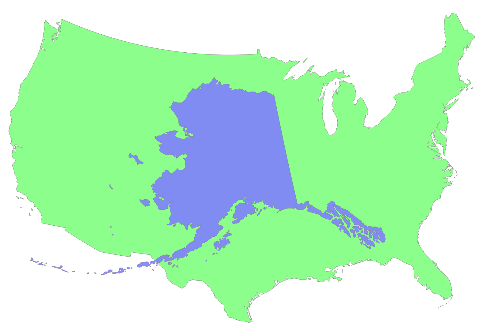
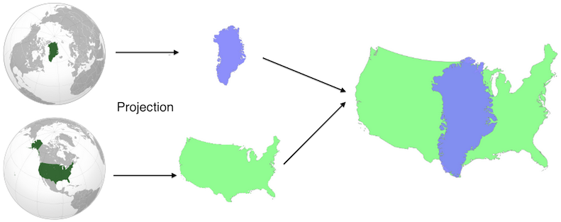
Comparea projects the two geographic features using equal area projections with the same scale but different centers. This results in a valid comparison of their areas with minimal distortion for each shape. You can read more on Comparea’s about page or study this nifty diagram:
It works great on both desktop and touch devices, where you can drag the two shapes with your fingers or pinch to zoom.
Like most of my side projects, this one was developed on and off over a long period of time. I first worked on the project in spring 2012, discovered Natural Earth Data and quickly made a purely client-side demo. The response was generally positive, but I didn’t release it because of general UI jankiness (the transitions never quite worked), the lack of a backend and the feeling that I didn’t have enough polygons to make it fun.
About a year later (in early 2013) I started playing with Open Street Maps data. There are tons of great polygons in their data dumps, including smaller features like Golden Gate Park or Central Park. I spent a few weeks playing around with this data set, but ultimately could’t come up with a good way of deciding which shapes were notable enough to include (there are millions, and not every one block park is notable enough for inclusion).
I’d shown the Comparea demo to enough people that I was convinced it was worth publishing. (One notable demo session was with my six year old nephew, who rattled off country comparisons to me for nearly an hour!) When I got some time off between jobs, I decided to make releasing Comparea an explicit goal.
In addition to the finished product, the real value of any side project is what you learn from doing it. Here were some highlights:
- Flask This was my third Flask project (after gitcritic and webdiff) and I finally knew enough to organize it correctly.
- The whole hosting stack was new to me. This was my first Heroku project and my first time using CloudFlare for distribution. I’m a big fan of both. Developing using Flask and Heroku is far more lightweight and flexible than using AppEngine, which was my tool of choice in the past.
- I rewrote the UI using D3. Its projection and behavior tools were godsends. These both made lots of gross SVG manipulation code from my initial demo melt away.
- I debugged Natural Earth Data shapes using IPython Notebooks. Nothing beats a visualization for spotting outlying islands, which could dramatically affect a feature’s bounding box.
One of the main bits of feedback I got on the initial Comparea demo was that it would be helpful to show the area of each feature somewhere in the UI, so that you could compare numerically in addition to visually. I expanded this request to include populations and descriptions for each place as well. Sourcing and verifying all this data wound up being one of the most challenging pieces of the project. For example: no one can quite agree on what’s Morocco and what’s Western Sahara. The areas and populations you compute will vary depending on where you draw the line, but sources don’t always say what their line is! To make sure I wasn’t doing anything too unreasonable, I calculated the areas of my polygons and then compared this value to the stated area from an official source. I iterated until they were all within about 10% of one another.
What’s next? I’d like to add more fine-grained shapes to allow comparisons like San Francisco vs. NYC or Golden Gate Park vs. Central Park. And I’d like to add a mode where you can move one shape around a complete map of another area. This would be helpful for comparing San Francisco to the entire NYC area, for example.
But for now, I’m happy to finally get this project launched. Enjoy!
Permalink