12.04.09
A new view on Minard’s Napoleon
Charles Minard’s chart of the demise of Napoleon’s Grand Armée is famous for its “brutal eloquence”. Edward Tufte says it “may well be the best statistical graphic ever drawn”.
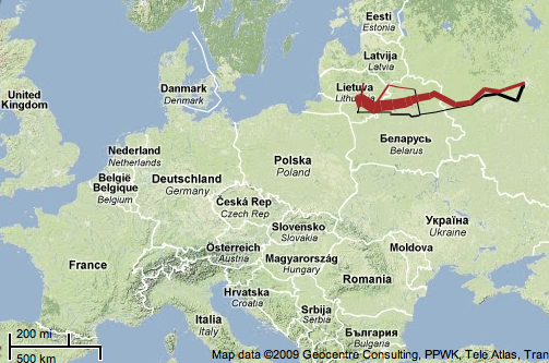
The width of the line represents the size of Napoleon’s army as it marched to Moscow and then retreated.
I found a version of this visualization put on a Google Map using protovis. This visualization is great! It draws attention to one of the main problems with this famous visualization: it doesn’t give any geographical context. I had no idea where Napoleon’s army started and turned around until I saw this map:
Some things that stand out:
- The Grand Armée was way far away from France at the start of this.
- The march wasn’t as long as I’d imagined. When I think “march across Russia”, the image in my mind goes halfway across Siberia.


Craig Fratrik said,
December 4, 2009 at 7:01 pm
I have The Visual Display of Quantitative Information in my possession from the library. Looking forward to reading it. I read about it on xkcd.
Craig Fratrik said,
December 28, 2009 at 9:20 am
Another data visualization xkcd.